IconSwitch组件的开发与测试
IconSwitch组件
使用了ant-design-vue中的a-tooltip和a-button组件。
<template>
  <div class="icon-switch">
    <a-tooltip :placement="placement" :title="title">
      <a-button :type="type" :shape="shape" @click="onChange">
        <slot></slot>
      </a-button>
    </a-tooltip>
  </div>
</template>

<script lang="ts">
import { defineComponent, computed } from 'vue';

export default defineComponent({
  name: 'IconSwitch',
  props: {
    value: {
      type: Boolean,
      default: false
    },
    placement: {
      type: String,
      default: 'top'
    },
    title: {
      type: String,
      default: 'title'
    },
    shape: {
      type: String,
      default: 'circle'
    }
  },
  emits: ['change'],
  setup(props, context) {
    const type = computed(() => {
      return props.value ? 'primary' : '';
    });
    const onChange = () => {
      context.emit('change', !props.value);
    };
    return {
      type,
      onChange
    };
  }
});
</script>
单元测试
import { mount, VueWrapper } from '@vue/test-utils';
import IconSwitch from '@/components/IconSwitch.vue';

const mockComponent = {
  template: '<div><slot>B</slot></div>'
};
let wrapper: VueWrapper<any>;
const title = '我是鼠标悬浮提示';
describe('IconSwitch.vue', () => {
  beforeAll(() => {
    wrapper = mount(IconSwitch, {
        props: {
          value: true,
          title
        },
        global: {
          components: {
            'a-button': mockComponent,
            'a-tooltip': mockComponent
          }
        }
      }
    );
  });
  it('测试title', () => {
    const tooltip = wrapper.findAll('.icon-switch>div')[0];
    // 判断传入的title
    expect(tooltip.attributes('title')).toBe(title);
  });
  it('测试title位置', async () => {
    const tooltip = wrapper.findAll('.icon-switch>div')[0];
    expect(tooltip.attributes('placement')).toBe('top');
    await wrapper.setProps({
      placement: 'topLeft'
    });
    // 判断传入的placement是否正确
    expect(tooltip.attributes('placement')).toBe('topLeft');
  });

  it('测试value值', async () => {
    // 判断传入的value值
    expect(wrapper.props('value')).toBeTruthy();
  });
  it('测试value值 - 2', async () => {
    await wrapper.setProps({
      value: false
    });
    // 判断传入的value值
    expect(wrapper.props('value')).toBeFalsy();
  });

  it('测试点击事件', async () => {
    const item = wrapper.get('div[type=primary]');
    // 触发点击事件
    await item.trigger('click');
    const events = wrapper.emitted('change');
    // 传入属性为 value === true,取反则为false
    expect(events[0]).toEqual([false]);
  });
  afterEach(() => {
    // 测试value值 - 2 会更改props,如果不还原会导致测试点击事件失败
    wrapper.setProps({
      value: true
    });
  });
});
集成到编辑器
步骤一
由于使用了图标,需要安装@ant-design/icons-vue,命令如下
cnpm install --save @ant-design/icons-vue
步骤二
在PropsTable组件中引入要使用的IconSwitch和字体组件
import IconSwitch from '@/components/IconSwitch.vue';
import BoldOutlined from '@ant-design/icons-vue/BoldOutlined';
import ItalicOutlined from '@ant-design/icons-vue/ItalicOutlined';
import UnderlineOutlined from '@ant-design/icons-vue/UnderlineOutlined';
步骤三
组件外层循环增加一个新的类名,命名规则为“组件名-item”,如icon-switch-item
步骤四
增加如下css样式
.icon-switch-item {
  display: inline-block;
  margin-right: 10px;
}
步骤五
设置第一个icon-switch距离左边的位置
    onMounted(() => {
      const firstElement = document.getElementsByClassName('icon-switch-item')[0] as HTMLElement;
      firstElement.style.paddingLeft = '28%';
    });
步骤六
编写css属性与组件的映射关系
  fontWeight: {
    component: 'icon-switch',
    subComponent: 'BoldOutlined',
    text: '',
    extraProps: {
      title: '常规/加粗'
    },
    initalTransform(value: string) {
      return value === 'bold';
    },
    afterTransform(value: boolean) {
      return value ? 'bold' : 'normal';
    },
    options: [{value: '', text: ''}]
  },
  fontStyle: {
    component: 'icon-switch',
    subComponent: 'ItalicOutlined',
    text: '',
    extraProps: {
      title: '常规/斜体'
    },
    initalTransform(value: string) {
      return value === 'italic';
    },
    afterTransform(value: boolean) {
      return value ? 'italic' : 'normal';
    },
    options: [{value: '', text: ''}]
  },
  textDecoration: {
    component: 'icon-switch',
    subComponent: 'UnderlineOutlined',
    text: '',
    extraProps: {
      title: '常规/下划线'
    },
    initalTransform(value: string) {
      return value === 'underline';
    },
    afterTransform(value: boolean) {
      return value ? 'underline' : 'none';
    },
    options: [{value: '', text: ''}]
  }
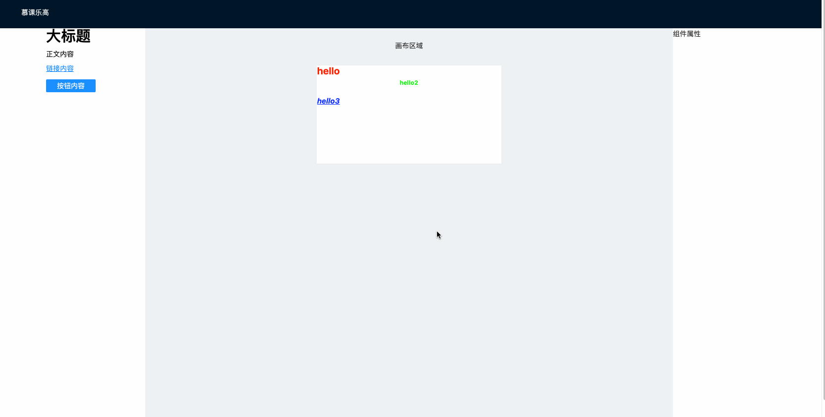
效果图